For Teachers
Bringing Data to Life with Matrices and Models
This series of learning activities explores the power of matrices in mathematics for organizing and analyzing data. Students learn to use basic R programming to transform matrices into engaging visualizations such as heatmaps and 3D models, making abstract data tangible and intuitive. By integrating 3D printing, the lessons culminate in creating physical models, demonstrating the practical application of data visualization techniques to represent real-world phenomena.

Keywords
matrix, data visualization, heatmap, 3D model, 3D printing
Lesson Narrative
The lessons are based on three key principles: duality, necessity, and repeated reasoning. These principles help connect abstract mathematical ideas, like matrices, to the real world by integrating computational thinking and data visualization.
Duality focuses on both mastering the subject, like using matrices to represent data, and building computational thinking skills.
Necessity ensures the lessons spark students’ curiosity and need to learn matrices in a meaningful way.
Repeated reasoning provides plenty of practice, helping students strengthen their computational thinking skills.
Together, these principles help students bridge the gap between abstract concepts and practical applications, giving them tools to better understand and model the world around them.
These lessons builds on concepts from previous units and introduces the matrix as a tool for data representation. In grade 7, students learn how to formulate questions, collect data, present it, and analyze it to answer those questions. They also gain experience using bar charts and pie charts for data presentation and interpretation. In this lesson, students extend their understanding by representing real-world data in matrix form and visualizing it through 3D modeling and printing.
In Lesson 1, students are introduced to the fundamentals of data visualization and matrix-based analysis. The tasks are carefully sequenced to build their understanding of how abstract data can be represented and interpreted using visual and numerical methods. The lesson begins with students observing and interpreting trends using visualizations, sparking their curiosity about temperature patterns. They then critically evaluate the effectiveness of a line chart, identifying its limitations and exploring improved methods of communication. Moving forward, students analyze heatmaps as an alternative visualization, comparing their effectiveness with line charts and learning to represent data as numerical matrices. Students engage with matrices to extract, interpret, and analyze numerical data, discovering how trends across rows or columns can reveal meaningful insights. To deepen their understanding, they practice summarizing data by reducing a matrix’s dimensionality through the calculation of averages. By the end of this lesson, students no longer see matrices as abstract arrays but as powerful tools for decoding and analyzing real-world data.
In Lesson 2, the foundational concepts of matrices and visualization are expanded through the integration of coding in R, enhancing students’ computational thinking. The tasks guide students to interact with code and matrices to create dynamic visualizations. Students start by exploring how simple R scripts generate heatmaps, learning how data structures relate to their visual representations. This introductory task helps students connect coding basics to data visualization. They then experiment with matrix parameters such as data, number of rows, and ordering methods, gaining hands-on experience in manipulating matrices and observing how changes affect visual outputs. Applying this knowledge, students work with real-world data, such as overlaps in social media platform usage, to create matrices and heatmaps that represent complex relationships. As they advance, students develop customized heatmaps, including a binary chessboard pattern, learning about color palettes and structured matrix designs. Finally, students transition from two-dimensional visualizations to the concept of three-dimensional data representation, exploring how matrix-based data can serve as the foundation for creating 3D models. This progression equips students with a deeper appreciation for the versatility of matrices in representing and visualizing diverse datasets.
Lesson 3 immerses students in the process of transforming elevation data into 3D models, combining data analysis, coding, and hands-on creation. The journey begins with students examining a 3D model of Mount Merapi, reflecting on how its visual representation connects to the underlying matrix-based data. This activity helps them grasp the concept of representing geographic information through three-dimensional visuals. Students then explore Shuttle Radar Topography Mission (SRTM) elevation data, learning about data resolution and tiling while discovering its applications in urban planning and environmental modeling. Using this data, they analyze its structure as a matrix and transform it into a 3D model. This step helps them understand the relationship between numerical matrices and real-world landscapes. To advance their skills, students utilize R packages like rayshader and terra to work with geographic data and create detailed 3D models. They explore how coding allows them to manipulate data and visualize it effectively. The final step in this lesson is a tangible one—students 3D print their Mount Merapi models, experiencing the process of transforming digital data into physical objects. This hands-on conclusion bridges the gap between abstract data analysis and real-world applications, leaving students with a comprehensive understanding of data representation and its transformative potential.
Learning Goals
Students will be able to represent real-world data (such as temperature or topography) in matrix form, interpret the data, and visualize it through 3D modeling and printing, converting abstract data into tangible models.
Required Materials
Computers or tablets with R programming
Access to a 3D printer
Projector and whiteboard
Required Preparation
Computer with R Programming: Teachers will need a computer with R installed to assist students in converting the elevation matrix into a 3D model. The {rayshader} package will be used to visualize and model the data.
3D Printer: A 3D printer will be required to print the 3D models created by students from the elevation data.
Learning Targets
Lesson 1:
Students will be able to represent data using matrices and interpret the information presented in matrix form.
Students will be able to evaluate and judge the effectiveness and efficiency of different data representations, including matrices.
Lesson 2:
Students will be able to convert a matrix into a heatmap and interpret the data visualization.
Students will be able to compare matrices, heatmaps, and 3D models to understand how each represents data.
Lesson 3:
Students will be able to use real-world topographical data (elevation matrix) to create a 3D model of a selected location.
Students will be able to print the 3D model using a 3D printer, turning abstract data into a physical representation.
Standards
Building On
Students can formulate questions, collect, present, and analyze data to answer the questions.
Students can use bar charts and pie charts to present and interpret data.
Adressing
- Students can represent data in matrix form.
Glossary Entries
Lesson 1
-
Data visualization
The process of turning numbers or information into pictures, graphs, or charts so that patterns and trends are easier to understand.
-
Heatmap
A type of chart that uses colors to show patterns in data. For example, warmer colors (like red or orange) can show higher values, and cooler colors (like blue) can show lower values.
-
Matrix
A grid of numbers organized in rows and columns, like a table, that helps us organize and analyze data.
Lesson 2
-
matrix()functionThe
matrix()function in R is used to create a matrix. You provide a set of data, define the number of rows (nrow), and specify whether the data should be filled by rows or columns using thebyrowargument. The syntax ismatrix(data, nrow, byrow). -
heatmap()functionThe
heatmap()function in R is used to create a heatmap from a matrix or data frame. It visually represents the values in the matrix using colors, helping to highlight patterns and trends. The function has arguments likex(the data matrix),Rowv,Colv(for hierarchical clustering), andscale(to adjust the scaling of the data). -
rep()functionThe
rep()function in R is used to repeat elements of a vector a specified number of times. It’s helpful for creating matrices where the data follows a repetitive pattern. -
3D model
A 3D model is a three-dimensional representation of data, where data points are placed in a three-dimensional space based on their values. This model can provide more depth and perspective compared to a matrix or 2D heatmap, making it useful for visualizing complex data relationships.
-
The
colorRampPalette()function in R is used to create a sequence of colors that can be applied to a heatmap. It takes a range of colors and interpolates between them to generate a smooth gradient.
Lesson 3
-
STL file
A file format commonly used for 3D printing, which stores 3D models in a way that is compatible with most 3D printers. The file contains the surface geometry of the model without any color or texture information. STL stands for “stereolithography,” a technology used in 3D printing.
-
Elevation data
Information that describes the height of a location on the Earth’s surface relative to sea level. This data is often represented in a matrix format, where each value corresponds to the elevation at a specific point on the terrain.
-
Hillshade
A grayscale representation of a 3D surface, created by simulating how light and shadows fall on terrain based on elevation data. Hillshading is often used in mapping and 3D visualization to enhance the perception of depth and topography.
-
Shuttle Radar Topography Mission (SRTM)
A NASA mission that used radar to measure the Earth’s surface and create detailed elevation maps. The SRTM data is widely used for various applications, including environmental modeling, urban planning, and disaster risk assessment.
-
3D printing
A manufacturing process that creates three-dimensional objects by adding material layer by layer based on a digital model. 3D printing allows for the production of complex shapes that might be difficult or impossible to create using traditional methods.
-
Raster data
A type of spatial data represented in grid cells or pixels. Each cell holds a value that represents information such as elevation, temperature, or land cover. Raster data is often used to represent continuous phenomena like elevation or weather patterns.
-
rayshader
An R package used to convert raster or matrix data into 3D models and visualizations. It allows users to create shaded relief maps, terrain models, and 3D plots based on elevation or other spatial data.
-
terra
An R package used for spatial data analysis, specifically designed to handle large raster datasets. It provides tools for reading, manipulating, and processing geospatial data, including elevation data.
-
raster
An R package for working with raster data, including functions for reading, manipulating, and analyzing geospatial raster data. The package supports a variety of raster formats and is commonly used for tasks like terrain analysis.
Additional Resources
Google/PowerPoint slides.
Real world data sources.
Tutorial on basic R programming (optional).
3D printing tutorial (optional).
Introduction to Matrix Representation
Learning Targets:
Students will be able to evaluate and judge the effectiveness and efficiency of different data representations, including matrices.
Students will be able to represent data using matrices and interpret the information presented in matrix form.
Task 1.1: Data Talks
The purpose of this Data Talks task is to engage students in observing and interpreting trends in data through visualization, fostering curiosity and initial reasoning about temperature patterns. This task sets the stage for exploring mathematical representations in subsequent tasks.
Possible Student Answers
Things students may notice:
Every year has a similar pattern where the temperature decreases in the middle of the year and increases toward the end.
Some years, like 2015 and 2016, seem to have higher peaks compared to others, but the general range of temperatures stays the same.
Things students may wonder:
I wonder if the changes in temperature are caused by seasonal differences or specific climate events.
Is the average temperature increasing over the years, or is it just fluctuating randomly?
Task Synthesis
This task introduces students to interpreting graphical representations of data by encouraging them to observe and question trends in Yogyakarta’s average monthly temperatures from 2011 to 2020. It promotes curiosity and critical thinking as students engage in “noticing and wondering.” Teachers can use this task to assess students’ prior knowledge of data interpretation and spark discussions on patterns and anomalies in the data, laying the groundwork for deeper exploration of data visualization in subsequent tasks.
Task 1.2: Interpreting and Redesigning Data Representations
The purpose of this task is to develop students’ critical thinking and data communication skills. Students will evaluate the effectiveness of a line chart for representing temperature trends, identify its limitations, and explore how to improve the visualization for clearer communication. This task serves as a stepping stone to introduce alternative representations, such as heatmaps, in the subsequent activity.
Possible Student Answers
What is the main message or insight about Yogyakarta’s average monthly temperature (2011–2020) as shown in the diagram?
“The main message is that Yogyakarta has a consistent seasonal temperature trend, with warmest months in the middle of the year and cooler months at the start and end.”
“The diagram highlights that, despite slight differences across years, the general monthly temperature trend is stable.”
Do you think the diagram effectively communicates this message? What could be improved?
“The diagram is clear, but separating the years into different graphs makes it harder to compare trends directly. A single graph might work better.”
“The graphs are a bit overwhelming because there are so many of them. Maybe simplifying the layout or focusing on one aspect of the data could help.”
How would you redesign this diagram to convey the same message more clearly or engagingly? Why?
“I would use one combined line chart with different colors for each year, so it’s easier to compare the trends in one place.”
“I would group the years into smaller time periods, like five-year averages, to make the graph less cluttered.”
Task Synthesis
This task sets the stage for introducing heatmaps by encouraging students to critique and redesign data representations. Teachers should guide students to identify limitations in the original figure, such as difficulties in comparing trends across years, and prompt discussions on what makes data visualizations clear and engaging. By exploring different ways to simplify and enhance the communication of data trends, students begin to develop an awareness of how alternative visualizations, like heatmaps, can address these limitations. These discussions build a foundation for understanding the utility of heatmaps in the next task.
Task 1.3: Are You Ready for More?
The purpose of this task is to help students analyze and interpret a heatmap as an alternative data visualization. Students will compare the heatmap with the original line charts, evaluate its advantages in communicating patterns and trends, and explore the idea of representing the data as a numerical matrix. This task builds understanding of heatmaps and lays the groundwork for introducing matrices as structured tools for numerical representation.
Possible Student Answers
What patterns or trends can you observe in Alex’s visualization (Figure 2)?
“I notice that the warmest months are in the middle of the year, and cooler months are at the beginning and end, which matches the seasonal trends from the line charts.”
“The heatmap makes it easier to spot which years had slightly higher or lower average temperatures compared to others.”
How does this representation help convey the message compared to the original diagram?
“The heatmap is less cluttered and lets you quickly see trends for all years at once without comparing multiple graphs.”
“Using colors to represent temperature makes it easy to spot differences across years and months without looking at individual numbers.”
How could you represent this figure more efficiently using only numbers? What would that look like?
“We could use a table with rows for years and columns for months, where each cell shows the average temperature.”
“The data could be organized in a grid with numbers instead of colors, but it might be harder to spot patterns compared to the heatmap.”
Task Synthesis
This task introduces heatmaps as an alternative visualization, encouraging students to observe patterns and compare their effectiveness with previous representations. Teachers should guide students in identifying how heatmaps provide a more intuitive way to compare trends across years and months, emphasizing the compactness and clarity of this representation. Encourage students to reflect on how the use of color gradients highlights variations and supports quick pattern recognition. This discussion primes students for the next task, where they will connect heatmaps to matrices, reinforcing their understanding of how data can be effectively organized and visualized.
Task 1.4: Decoding Data with Matrices
This task introduces students to using matrices to extract, interpret, and analyze numerical data. Students will develop the ability to locate specific data points in a matrix, describe trends across rows or columns, and compare data values to draw meaningful conclusions.
Possible Student Answers
What is the average temperature for the third quarter (Jul–Sep) of 2020?
“The average temperature for Q3 of 2020 is 24.94°C.”
“I found the value by looking at the last row (2020) and the third column (Q3).”
How would you describe the trend in the average temperature throughout 2019?
“In 2019, the temperature increases from Q1 to Q3 and slightly decreases in Q4.”
“The temperatures are lowest in Q1 and highest in Q3, showing a peak in mid-year.”
Which year had the highest average temperature? Which year had the lowest?
“2019 had the highest average temperature, and 2017 had the lowest.”
“I found the highest and lowest averages by summing each row and dividing by 4, then comparing the results.”
Task Synthesis
This task helps students practice interpreting matrices by locating specific data points, analyzing trends within a row, and comparing values across years. Teachers should ensure students understand how to navigate the matrix structure and encourage them to explain their reasoning. It’s important to connect the task to real-world applications, such as environmental data, and consider guiding students through any challenges with matrix navigation or comparison. For advanced learners, encourage exploring additional patterns or extending the matrix for further analysis.
Task 1.5: Are You Ready for More?
This task aims to deepen students’ understanding of summarizing data by reducing a matrix’s dimensionality. Students analyze how averages are calculated across rows and learn to articulate data transformation processes.
Possible Student Answers
What Paulina did:
“Paulina added all the numbers in each row (each year) and then divided by 4 because there are 4 quarters.”
“Paulina calculated the average temperature for each year by summing the temperatures of all four quarters in a row and dividing the total by the number of quarters (4). This reduced the matrix to one value per year.”
Task Synthesis
This task helps students connect mathematical operations (averaging) with real-world data transformations, fostering a deeper understanding of data simplification. Teachers should encourage students to focus on the reasoning behind summarizing data while reinforcing how such transformations maintain the essence of the original information.
From Numbers to Visualization: Exploring Matrices, Heatmaps, and 3D Models
Learning Targets:
Students will be able to convert a matrix into a heatmap and interpret the data visualization.
Students will be able to compare matrices, heatmaps, and 3D models to understand how each represents data.
Task 2.1: Notice and Wonder
The purpose of this task is to introduce students to the relationship between R code and the resulting heatmap. By analyzing a simple code example and the resulting heatmap, students will learn how data is structured in a matrix and how it is visually represented through a heatmap. This task serves as an introduction to the basics of coding and data visualization in R.
Student Facing
Possible Student Answers
Things students may notice:
Areas of the heatmap are shaded differently, with darker or lighter regions corresponding to higher or lower numbers in the matrix.
The
matrix()function creates a matrix with values arranged in rows and columns. They could also notice that theheatmap()function is used to create a heatmap from a matrix.
Things students may wonder:
How would changing the values in the matrix affect the heatmap’s color pattern?
What would happen if we changed the
Rowv,Colv, andscaleparameters in the heatmap function? How would it impact the visual representation?
Task Synthesis
In this task, students should connect the matrix values and the heatmap’s visual representation. Teachers should encourage them to focus on how the matrix values are mapped to color intensities in the heatmap and how the parameters in the heatmap() function (such as Rowv and Colv) affect the result. Teachers can guide students by asking questions like, “How do the colors in the heatmap relate to the numbers in the matrix?” or “What happens if we change the matrix values or the scaling in the code?” This task sets the stage for further exploration of more complex visualizations in R, helping students see how data can be represented in both matrix form and as a heatmap.
Task 2.2: Exploring Matrices and Visualizing with Heatmaps
The purpose of this task is to deepen students’ understanding of how to manipulate matrices in R and how their changes affect the resulting heatmap visualization. By experimenting with matrix parameters such as data, nrow, and byrow, students will gain insights into how these parameters structure the matrix and how they influence the heatmap representation. The task provides an interactive, hands-on opportunity to learn about matrix construction and data visualization through heatmaps.
Possible Student Answers
Students may notice that changing the values in
datadirectly alters the contents of the matrix. For example, if they change the values from c(6, 2, 4, 5, 6, 1, 3, 2) to another set of numbers, the matrix will display different values, which will be reflected in the heatmap.Students will observe that modifying the
nrowargument changes the number of rows in the matrix. For instance, if they set nrow to 2, the matrix will have only 2 rows, and the data will be reorganized accordingly.When students set
byrow = TRUE, the matrix fills row by row. If they change it to FALSE, the matrix will fill column by column. Students should notice how this reordering of data affects both the matrix’s structure and the heatmap’s appearance.
Task Synthesis
In this task, students are encouraged to experiment with modifying the matrix parameters and observe how these changes affect both the matrix and the heatmap. Teachers can facilitate the learning process by guiding students to ask questions such as “What happens when you change the number of rows?” or “How does changing byrow from TRUE to FALSE affect the arrangement of data in the matrix?” Teachers should encourage students to make connections between the matrix structure and how that structure is visually represented in the heatmap. Through experimentation, students will gain a deeper understanding of matrices, their construction, and how data can be visually represented using heatmaps.
Task 2.3: Visualizing Social Media Platform Overlaps
The purpose of this task is to help students apply their understanding of matrices and heatmaps to a real-world data set, specifically focusing on social media platform overlaps. Through this task, students will learn how to create and manipulate matrices in R, assign appropriate row and column names, and visualize data using a heatmap. The goal is for students to connect the concept of matrix manipulation to visualizing complex relationships (such as overlaps in social media platform usage) and to understand how heatmaps can effectively represent this data.
Possible Student Answers
# Creating the matrix
matrix_sm_overlaps <- matrix(
  data = c(100, 74.6, 70.7, 76.9, 48.4,
           73.5, 100, 73.3, 77.9, 53.2,
           75.3, 77.8, 100, 78.8, 49.9,
           77.1, 80.5, 76.6, 100, 53.7,
           77.2, 81.9, 72.5, 80.1, 100),
  nrow = 5,
  byrow = TRUE
)

# Assigning row and column names
rownames(matrix_sm_overlaps) <- c("Youtube users", "Facebook users", "WhatsApp users", "Instagram users", "TikTok users")
colnames(matrix_sm_overlaps) <- c("Using Youtube", "Using Facebook", "Using WhatsApp", "Using Instagram", "Using TikTok")

# Visualizing with a heatmap
heatmap(
  x = matrix_sm_overlaps,
  Rowv = NA,
  Colv = NA,
  scale = "none"
)
Task Synthesis
This task involves a series of steps that allow students to practice both matrix manipulation and data visualization. Teachers should emphasize the importance of understanding how matrix data corresponds to the layout of the heatmap, where the values in the matrix are represented by color gradients. It’s essential for students to grasp that the heatmap is a tool to visualize relationships between data points, in this case, the overlaps in social media usage. Teachers should encourage students to explore the heatmap, noticing how strong or weak overlaps are visually represented, and discuss how they might interpret these overlaps in terms of trends or patterns.
Task 2.4: Are You Ready for More?
The goal of this task is to deepen students’ understanding of how to manipulate matrices and customize heatmaps using colors. By creating a chessboard pattern as a heatmap, students will learn how to represent binary data visually, adjust color schemes using colorRampPalette, and work with larger matrices to create more complex visualizations. This task builds on the previous ones by incorporating new elements like a custom color palette and a more structured matrix layout, helping students see how flexibility in visualization tools can be used to convey different types of data.
Student Facing
Take a look at the code below and think about what it’s doing.
matrix_example_3 <- matrix(
  data = c(0, 1, 0, 1, 0, 1, 0, 1, 0),
  nrow = 3,
  byrow = TRUE
)

red_blue <- colorRampPalette(
  colors = c("red", "blue")
)

heatmap(
  x = matrix_example_3,
  Rowv = NA,
  Colv = NA,
  labRow = NA,
  labCol = NA,
  scale = "none",
  col = red_blue(2)
)
Now, using the idea from the previous code, create a chessboard pattern as a heatmap of a matrix! Your result should look similar to the example shown in Figure 3.
Possible Student Answers
# Creating the matrix
matrix_chessboard <- matrix(
  data = rep(c(rep(c(1, 0), 4), rep(c(0, 1), 4)), 4),
  ncol = 8,
  byrow = TRUE
)

# Customizing the color palette
black_white <- colorRampPalette(c("white", "black"))

# Generating the heatmap
heatmap(
  x = matrix_chessboard,
  Rowv = NA,
  Colv = NA,
  labRow = NA,
  labCol = NA,
  scale = "none",
  col = black_white(2)
)
Task Synthesis
This task helps students practice matrix creation, color customization, and heatmap visualization. Teachers should guide students to understand how the matrix’s numeric values (1s and 0s) translate into visual data when used with the heatmap() function. If students struggle with manually creating the alternating binary pattern for the matrix, the rep() function can be introduced. The rep() function repeats elements in a vector and is helpful for creating the repeating 1s and 0s pattern in the matrix. For example, rep(c(1, 0), 4) repeats the sequence of 1, 0 four times. Teachers can explain how this can be extended to generate larger matrices for the chessboard-like pattern.
Encourage students to experiment with different color schemes using colorRampPalette() to see how the heatmap appearance changes. Discuss how this task connects to real-world data visualization scenarios, where binary or categorical data are represented visually. After the task, students should be able to explain how their color choices and matrix structure influence the heatmap, and how the rep() function can be used to simplify creating repetitive numeric patterns in matrices.
Task 2.5: Exploring Data Representations–From Matrix to 3D Model
The purpose of this task is to explore different data representations (matrix, heatmap, 3D model) and to help students understand how data can be visualized in various forms, each with its own advantages and limitations. The task also introduces students to the concept of creating 3D models based on matrices.
Student Facing
Heatmaps are just one way to represent a matrix. We can also create a 3D model from a matrix. Below, you’ll find three representations of the same data:
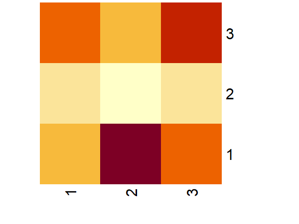
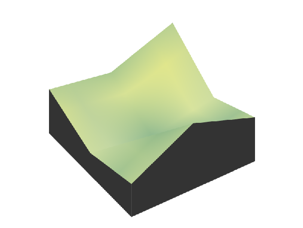
Compare and contrast these three representations. What are the strengths and weaknesses of each?
Now, focus on the 3D visualization. How would you create such a 3D model starting with a matrix? Identify the steps or processes involved.
Possible Student Answers
Comparison of representations: The matrix representation provides the raw data, which is useful for precise values, but it is hard to identify patterns or trends. The heatmap is easier to read visually because it uses colors to represent the data, making it easier to spot high and low values at a glance. However, it doesn’t show exact values, and the color scale might be misleading. The 3D model adds depth to the data, giving a clear sense of how the values change across the matrix. It’s more immersive and can highlight complex patterns, but it’s harder to interpret and requires more effort to create. Each representation has its strengths, but the choice depends on what aspect of the data you want to focus on—raw values, patterns, or relationships in three dimensions.
Creating a 3D model: To create a 3D model from a matrix, we first need to assign each value in the matrix a position in 3D space, where the rows could represent the X-axis, the columns the Y-axis, and the values themselves the Z-axis. Then, using a tool we would plot these points in 3D space.
Task Synthesis
Encourage students to reflect on how each representation serves different purposes. The matrix is effective for showing raw data, but it may not be the most intuitive for understanding trends or patterns. The heatmap provides an accessible visual interpretation but may lack the depth that a 3D model offers. The 3D model is useful for showing more complex relationships but requires additional tools and understanding.
Modeling the World: Topography with Matrices
Learning Targets:
Students will be able to use real-world topographical data (elevation matrix) to create a 3D model of a selected location.
Students will be able to print the 3D model using a 3D printer, turning abstract data into a physical representation.
Task 3.1: Notice and Wonder
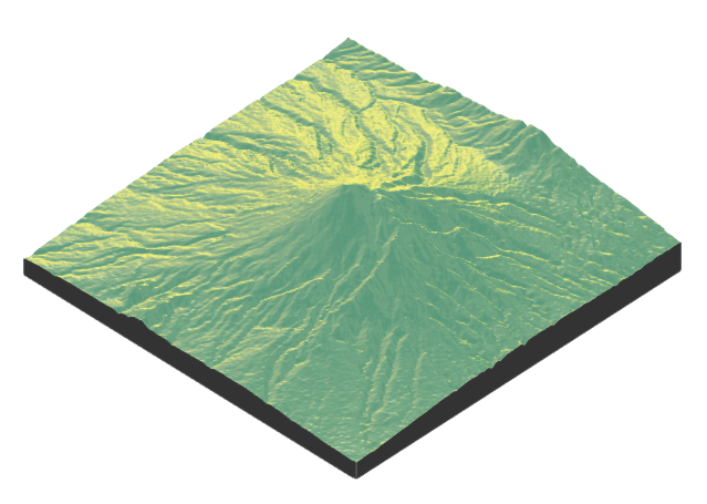
The purpose of this task is to encourage students to observe and reflect on the 3D model of Mount Merapi and make connections between the visual representation and the underlying data it represents. This will also help them understand how 3D models can be used to convey geographic and scientific information.
Student Facing
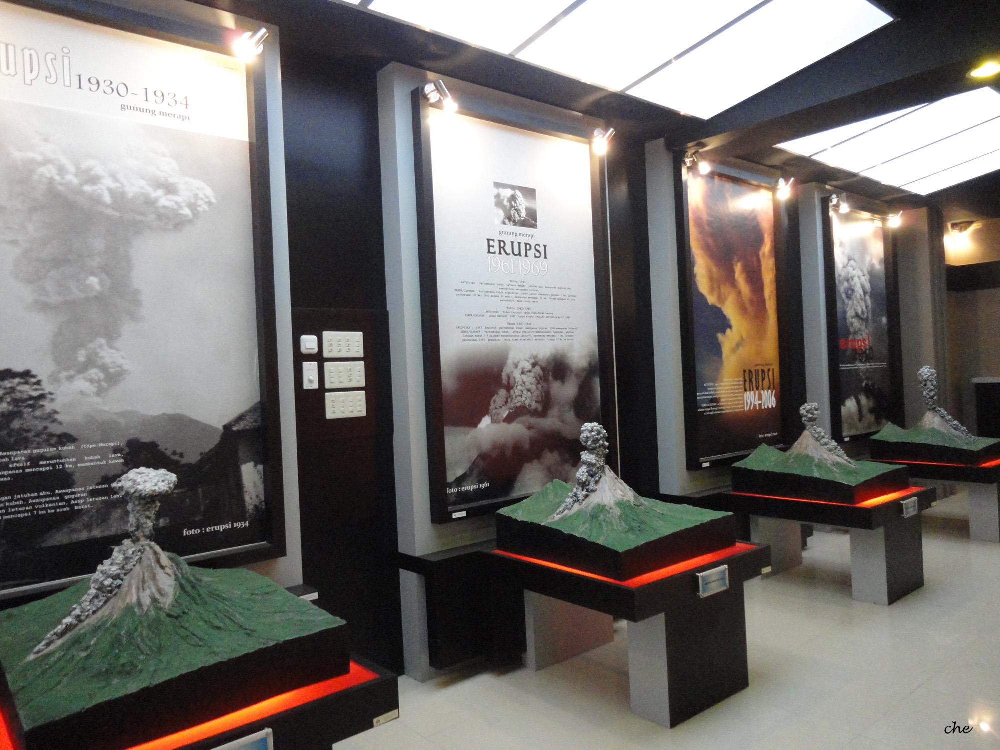
What do you notice? What do you wonder?
Possible Student Answers
Things students may notice:
The model shows different elevations and varying terrain, indicating peaks and valleys on the mountain.
The 3D representation looks realistic, with detailed features like ridges and slopes.
Things students may wonder:
How was this 3D model created? What kind of data was used to make the model?
Does this model show recent changes to Mount Merapi, like lava flow or eruptions?
How accurate is the model? Does it reflect the current state of the mountain?
What kind of technology or tools were used to capture the mountain’s features and convert them into a 3D model?
Task Synthesis
This task helps students engage with the concept of 3D modeling by having them reflect on the visual features of the model and consider its real-world implications. Teachers should encourage students to explore how such models could be constructed, for example, using topographic maps or satellite data. Teachers can guide the discussion by asking students to think about how 3D models can help us understand and visualize complex geographic and scientific data.
Task 3.2: Exploring Elevation Data Online
The purpose of this task is to introduce students to the Shuttle Radar Topography Mission (SRTM) data and its representation as elevation data. Students will explore how the data is structured into tiles, understand the meaning of terms like “30-meter resolution,” and recognize how this data can be used for real-world applications like urban planning and environmental modeling. By considering the elevation data as a matrix, students will learn how to analyze and visualize terrain information.
Possible Student Answers
The SRTM elevation data provides information about the height or elevation of the Earth’s surface, such as mountains, valleys, and flatlands. It can be used in urban planning, environmental modeling, disaster risk assessment, and infrastructure development. The data helps us understand the terrain and make informed decisions based on the landscape’s shape and features.
The elevation data on the Tile Downloader website is presented in “tiles,” which are sections of the Earth’s surface. Each tile contains elevation data for a specific geographic area. Users can download these tiles to work with the data for a particular region or project.
“30-meter resolution” means that each data point represents a 30-meter by 30-meter area on the ground. This provides a relatively high level of detail for mapping and analyzing terrain features. A “tile” refers to a small section of the Earth’s surface, divided into manageable units for easier storage and processing.
The data from a single tile can be represented as a matrix with rows and columns, where each cell in the matrix corresponds to an elevation value at a specific point on the Earth’s surface. Each matrix value represents the height of the land at that specific location in the grid.
To create a physical 3D model, you would first download the elevation data for the region you’re interested in. Then, you would convert the matrix values into 3D coordinates, which represent the height of the terrain. After that, you could use 3D modeling software to generate a digital model, which can be printed using a 3D printer to create a physical model of the terrain.
Task Synthesis
Teachers should support students in connecting the SRTM data to real-world applications, emphasizing the significance of elevation data for terrain analysis. It’s important to guide students through understanding how the matrix structure works, where each cell corresponds to an elevation value and how these values represent physical geography. When discussing terms like “30-meter resolution” and “tile,” teachers should provide examples and visual aids to reinforce the concept of how data is broken into smaller, manageable sections for easier analysis.
Task 3.3: Elevating Data into 3D Models
The purpose of this task is to help students understand how elevation data can be represented in a matrix and how such data can be used to create a 3D model of a landscape. It encourages students to explore the relationship between data in a matrix and its representation in the real world, particularly in terms of 3D visualizations.
Possible Student Answers
Elevation values in a matrix represent the height of the land at different points. If we think of the matrix as a map, each number tells us how high or low the land is at that spot. Higher numbers mean higher points, like mountains, and lower numbers mean lower points, like valleys or flat ground.
If we turn this matrix into a 3D model, the differences in elevation would look like bumps or dips on the land. If the numbers next to each other are very different, we’ll see a steep hill or valley. If they are similar, the land will look flat or gently sloping.
First, we need the matrix, which has all the elevation numbers. Then, we use software to turn those numbers into a 3D shape, like a mountain or a plain. The process involves putting the matrix into the software, which reads the numbers and builds a model based on them. The output is a 3D map or model that shows how the land looks in real life.
Task Synthesis
This task helps students understand how mathematical data in the form of a matrix can represent real-world physical features like mountains, valleys, and flat land. Teachers should guide students to connect how the numbers in the matrix relate to changes in elevation on the land. If students struggle, they can explore software or tools that convert these matrices into 3D visualizations. Encourage them to think about how this data is used in the real world, such as for planning cities or understanding the environment.
Task 3.4: Are You Ready for More?
The purpose of this task is to guide students through a more advanced application of elevation data to create 3D models using R programming. This task introduces students to the process of working with geographic data and visualization tools, using specific R packages like rayshader, terra, and raster. It encourages students to explore coding as a tool for transforming raw elevation data into 3D printed models.
Possible Student Answers
In the code, the first step involves loading three essential R packages:
rayshader,terra, andraster. The second step starts by loading the elevation data from a file (S08E110.hgt) using theterra::rast()function. Theraster::extent()function defines the boundaries around Mount Merapi, focusing the analysis on this specific region. Then,the terra::crop()function is used to crop the elevation data to these boundaries, andrayshader::raster_to_matrix()converts the cropped data into a matrix, which is suitable for creating 3D visualizations. In the third step, thesphere_shade()function generates a 3D hillshade effect and theplot_3d()function is used to display the 3D model with exaggerated elevation changes (via thezscale = 30parameter). Finally, in the fourth step, the 3D model is saved as an STL file using thesave_3dprint()function.The result will be a 3D model of Mount Merapi.
Task Synthesis
This task provides an opportunity for students to learn how to transform geographical elevation data into a 3D model using R programming. Teachers should ensure that students understand the purpose of each step in the code and how the packages interact to produce the final output. If students struggle with the technical aspects of the code, guide them through the function calls and explain how the data flows from one step to the next. Emphasize the real-world application of this process, such as using 3D models in environmental studies or urban planning. Teachers can also suggest that students explore the STL file and try printing the 3D model to see how the code translates to a physical object.
Task 3.5: 3D Printing the Model
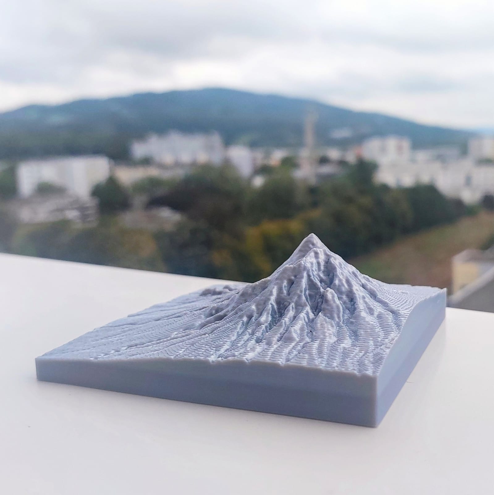
The purpose of this task is to connect the virtual model of Mount Merapi created from elevation data with the physical world by printing the 3D model using a 3D printer. This task allows students to understand the final step in the 3D model creation process and experience how digital data can be transformed into a tangible object.
Task Synthesis
Teachers should guide students through the steps of 3D printing, emphasizing the importance of preparing the STL file and checking it in the printer software to avoid issues during printing. Students should understand the significance of selecting the correct settings for materials and print quality. Teachers can also explain how 3D models like this can enhance learning by providing a physical representation of complex concepts, like terrain and elevation. After the printing process, it would be useful to discuss the differences between digital models and physical objects, encouraging students to think critically about how technology transforms data into something they can touch and analyze.
Summary
Matrices are a powerful tool for representing and analyzing data in a structured way. By converting elevation data into a matrix, we can visualize topographic features like mountains and valleys. In this lesson, we used matrices to represent elevation data from the Shuttle Radar Topography Mission (SRTM), and then transformed that data into a 3D model, simulating the physical features of the Earth’s surface. For example, we modeled and 3D-printed a representation of Mount Merapi, a well-known active volcano in Indonesia. The outcome of this process is shown in Figure 5.
This exercise helps us see how abstract data can be turned into meaningful, real-world representations, such as terrain models, and how mathematics can be applied to understand and visualize landscapes. Through this lesson, you learned how matrices can be used to model topography and how 3D printing brings these models
-
Emma wants to know the prices of iPhones on Amazon. She surveys the prices for the 128 GB, 256 GB, and 512 GB models of the iPhone 15 Plus, iPhone 16, iPhone 16 Plus, and iPhone 16 Pro. The prices she found are as follows (in euros):
For 128 GB: iPhone 15 Plus (€919), iPhone 16 (€876), iPhone 16 Plus (€1078), iPhone 16 Pro (€1143)
For 256 GB: iPhone 15 Plus (€1037), iPhone 16 (€1055), iPhone 16 Plus (€1188), iPhone 16 Pro (€1294)
For 512 GB: iPhone 15 Plus (€1289), iPhone 16 (€1269), iPhone 16 Plus (€1354), iPhone 16 Pro (€1592)
Represent this data as a matrix!
Solution:
To represent the price data Emma found as a matrix, we can organize it by rows for the different models of the iPhone and columns for the different storage capacities (128 GB, 256 GB, and 512 GB). Here’s how the matrix would look:
\[ \begin{pmatrix}919 & 1037 & 1289 \\876 & 1055 & 1269 \\1078 & 1188 & 1354 \\1143 & 1294 & 1592 \\\end{pmatrix} \]
-
In the interactive code block below, create a matrix named
matrix_iphone_pricesto store the iPhone prices for different models and storage sizes. Then, visualize the matrix as a heatmap to better understand the price differences.Solution:
matrix_iphone_prices <- matrix(
  data = c(919, 1037, 1289, 876, 1055, 1269, 1078, 1188, 1354, 1143, 1294, 1592),
  nrow = 4,
  byrow = TRUE
)

colnames(matrix_iphone_prices) <- c("128 GB", "256 GB", "512 GB")
rownames(matrix_iphone_prices) <- c("iPhone 15 Plus", "iPhone 16", "iPhone 16 Plus", "iPhone 16 Pro")

heatmap(
  x = matrix_iphone_prices,
  Rowv = NA,
  Colv = NA,
  scale = "none"
)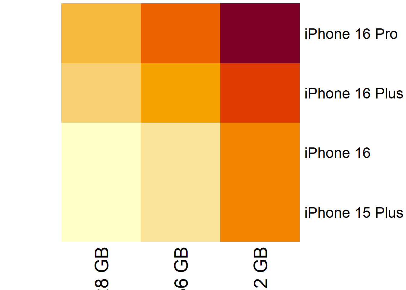
-
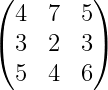
Figure 6 shows a 3D visualization of a matrix. Write down the matrix with approximate values.
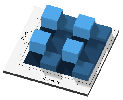
Figure 6: 3D visualization of a matrix Solution:
Answer may vary. Here is one possible answer:
\[ \begin{pmatrix} 2 & 4 & 2 & 4 \\ 6 & 3 & 6 & 3 \\ 2 & 3 & 2 & 3 \\ 6 & 4 & 6 & 4 \\ \end{pmatrix} \]
-
Model the topography of your selected places and then print the 3D models!
Solution:
Answer may vary. For example, students living near Lake Toba in North Sumatra might choose to model the lake. A 3D representation of the lake is shown in Figure 7.
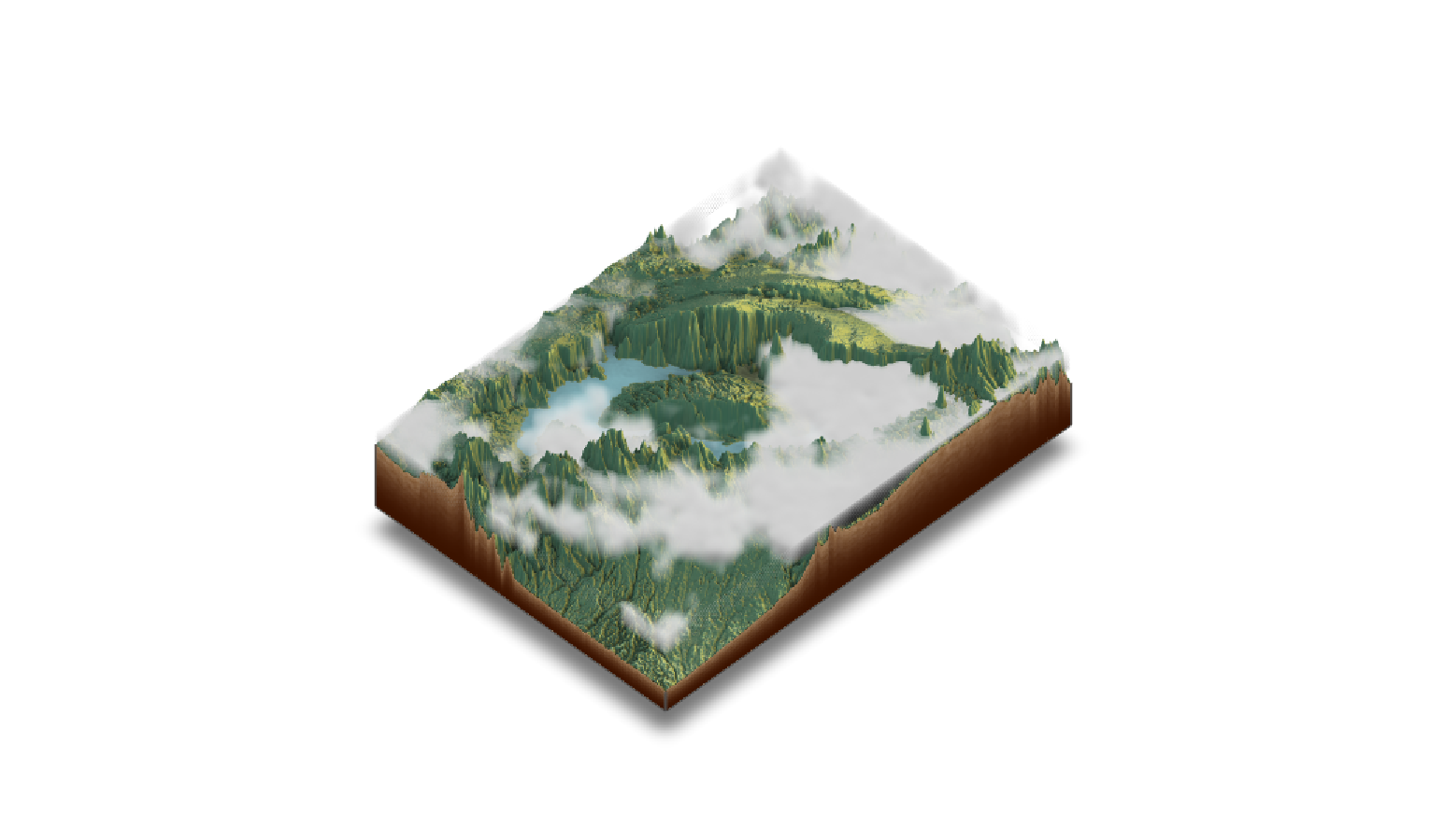
Figure 7: 3D model of Lake Toba
Reuse
Copyright
© 2024 Yosep Dwi Kristanto