For Students

Bringing Data to Life with Matrices and Models

In this series of activities, you’ll discover how matrices in math help us organize and analyze data. You’ll learn to use R programming to turn these matrices into cool visualizations like heatmaps and 3D models. Finally, you’ll bring your work to life by 3D printing your models, showing how these techniques can be used to represent real-world data in a hands-on way!
Published

November 25, 2024

Modified

December 7, 2024

Keywords

matrix, data visualization, heatmap, 3D model, 3D printing

Introduction to Matrix Representation

Let’s explore some data representations!

Data Talks
Figure 1: Understanding Yogyakarta’s temperature trends (2011–2020)

What do you notice? What do you wonder?

Interpreting and Redesigning Data Representations
  1. What is the main message or insight about Yogyakarta’s average monthly temperature (2011–2020) as shown in Figure 1?

  2. Do you think the diagram effectively communicates this message? What could be improved?

  3. How would you redesign this diagram to convey the same message more clearly or engagingly? Why?

Figure 2 is a visual representation provided by your friend Alex as an alternative to convey the same message about Yogyakarta’s average monthly temperature (2011–2020).

Figure 2: Alex’s work
  1. What patterns or trends can you observe in Alex’s visualization (Figure 2)?

  2. How does this representation help convey the message compared to the original diagram?

  3. How could you represent this figure more efficiently using only numbers? What would that look like?

Decoding Data with Matrices

The matrix below shows the average temperature for each quarter at Bromo Tengger Semeru National Park from 2016 to 2020. Each row corresponds to a year (2016–2020), and each column represents a quarter: Q1 (Jan–Mar), Q2 (Apr–Jun), Q3 (Jul–Sep), and Q4 (Oct–Dec).

\[ \begin{pmatrix} 26.12 & 25.73 & 25.03 & 25.36 \\ 25.03 & 24.68 & 24.48 & 26.15 \\ 24.90 & 25.10 & 24.64 & 26.45 \\ 25.40 & 24.71 & 24.65 & 27.78 \\ 26.01 & 25.21 & 24.94 & 25.95 \\ \end{pmatrix} \]

  1. What is the average temperature for the third quarter (Jul–Sep) of 2020?

  2. How would you describe the trend in the average temperature throughout 2019?

  3. Which year had the highest average temperature? Which year had the lowest?

To answer the third question, your friend Paulina created a new matrix that shows the average temperature for each year. The matrix is shown below. Can you explain in detail what she did to create this matrix?

\[ \begin{pmatrix}25.56 \\25.08 \\25.27 \\25.63 \\25.52 \\\end{pmatrix} \]

Summary

Matrices are powerful tools in mathematics that help us organize and represent data in a structured way. A matrix is simply a grid of numbers arranged in rows and columns. It can be used to display various types of data, such as temperature, sales figures, or any other information that can be grouped into categories.

For example, you can use a matrix to represent temperature data. Let’s say we want to show the average temperature at a specific place throughout the year. Instead of writing down a long list of numbers, we can arrange the temperature data in a matrix. Each row could represent a year, and each column could represent a season or a specific time period, such as months or quarters.

For instance, the following matrix shows the average temperature at Bromo Tengger Semeru National Park for each quarter of the year, from 2016 to 2020:

\[ \begin{pmatrix} 26.12 & 25.73 & 25.03 & 25.36 \\ 25.03 & 24.68 & 24.48 & 26.15 \\ 24.90 & 25.10 & 24.64 & 26.45 \\ 25.40 & 24.71 & 24.65 & 27.78 \\ 26.01 & 25.21 & 24.94 & 25.95 \\ \end{pmatrix} \] In this matrix:

  • The rows represent the years (2016 to 2020).

  • The columns represent the quarters of the year (Jan-Mar, Apr-Jun, Jul-Sep, Oct-Dec).

  • The numbers inside the matrix represent the average temperature for each quarter.

Using a matrix to represent temperature data makes it easier to analyze and spot patterns, such as trends in temperature over time or comparing different years and seasons. Matrices help us organize and interpret data more efficiently, providing clear insights into the information.

Glossary Entries
  • Data visualization

    The process of turning numbers or information into pictures, graphs, or charts so that patterns and trends are easier to understand.

  • Heatmap

    A type of chart that uses colors to show patterns in data. For example, warmer colors (like red or orange) can show higher values, and cooler colors (like blue) can show lower values.

  • Matrix

    A grid of numbers organized in rows and columns, like a table, that helps us organize and analyze data.

From Numbers to Visualization: Exploring Matrices, Heatmaps, and 3D Models

Let’s turn matrices into heatmaps and 3D models!

Notice and Wonder
matrix_example <- matrix(
  data = c(5, 3, 1, 7, 4, 10),
  nrow = 3,
  byrow = TRUE
)

heatmap(
  x = matrix_example,
  Rowv = NA,
  Colv = NA,
  scale = "none"
)

What do you notice? What do you wonder?

Exploring Matrices and Visualizing with Heatmaps

Use the interactive code block below to create a matrix called matrix_example_2. Modify the values in the data, nrow, and byrow (TRUE or FALSE) arguments to explore their meanings. Click the “Run Code” button to see the results. Based on your exploration, what do you think each of these arguments does?

Once you’ve created your matrix, use the code block below to generate a heatmap of matrix_example_2.

Observe how the matrix values are represented in the heatmap. Experiment by changing the matrix values and regenerating the heatmap to see how it changes.

Visualizing Social Media Platform Overlaps

Table 1 shows the percentage of active users (age 16+) outside China who also use other social media platforms.

Table 1: Social media platform audience overlaps. Source: DataReportal
Using Youtube Using Facebook Using WhatsApp Using Instagram Using TikTok
Youtube users 100 74.6 70.7 76.9 48.4
Facebook users 73.5 100 73.3 77.9 53.2
WhatsApp users 75.3 77.8 100 78.8 49.9
Instagram users 77.1 80.5 76.6 100 53.7
TikTok users 77.2 81.9 72.5 80.1 100
  1. Use the data from Table 1 to create a matrix in R and name it matrix_sm_overlaps.

  2. Assign appropriate row and column names using the rownames() and colnames() functions to represent the social media platforms.

  3. Visualize the overlaps by creating a heatmap from the matrix.

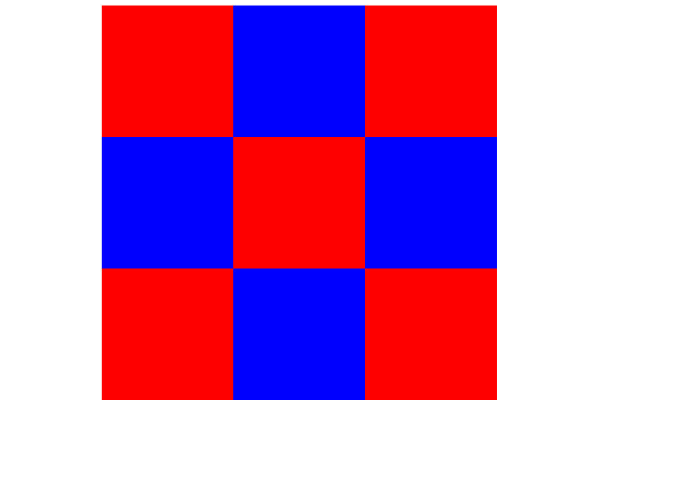
Take a look at the code below and think about what it’s doing.

matrix_example_3 <- matrix(
  data = c(0, 1, 0, 1, 0, 1, 0, 1, 0),
  nrow = 3,
  byrow = TRUE
)

red_blue <- colorRampPalette(
  colors = c("red", "blue")
)

heatmap(
  x = matrix_example_3,
  Rowv = NA,
  Colv = NA,
  labRow = NA,
  labCol = NA,
  scale = "none",
  col = red_blue(2)
)

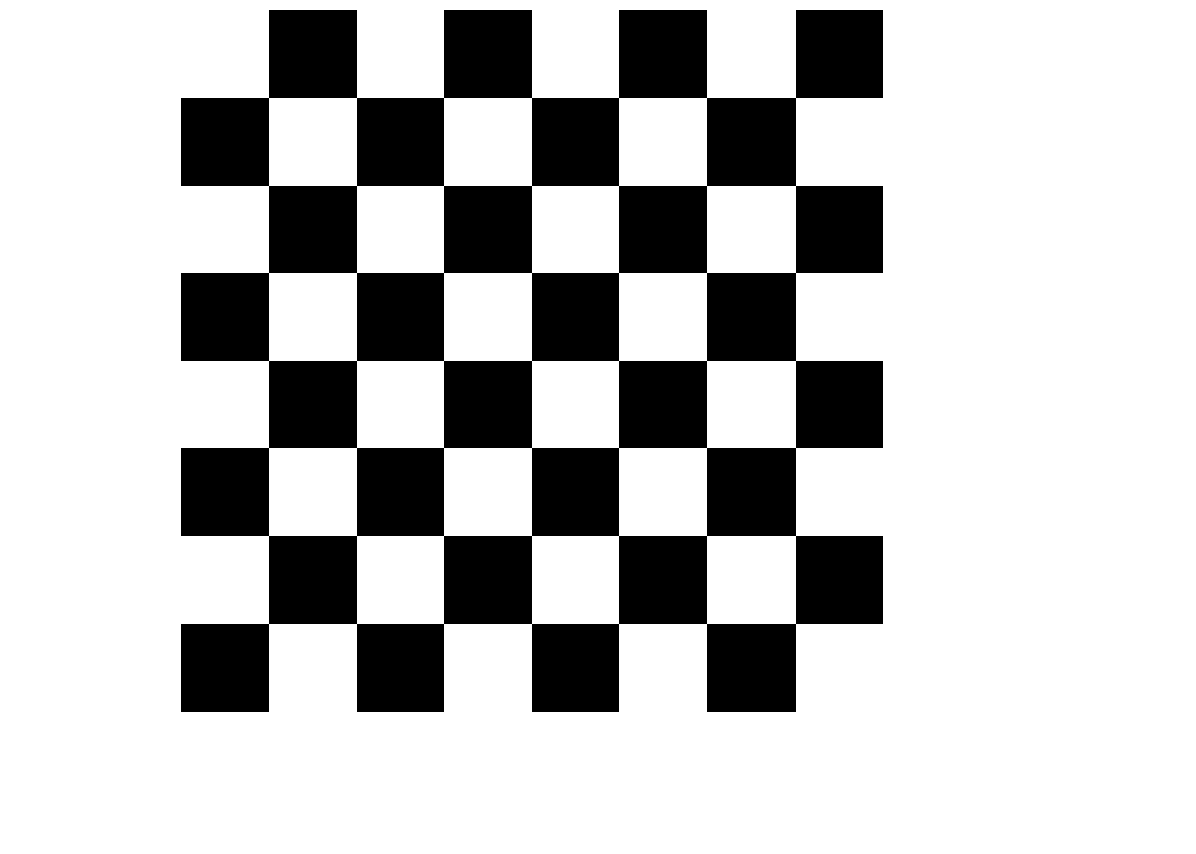
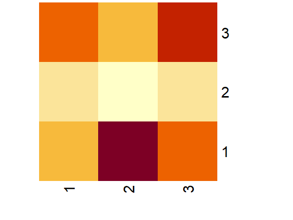
Now, using the idea from the previous code, create a chessboard pattern as a heatmap of a matrix! Your result should look similar to the example shown in Figure 3.

Figure 3: A chessboard
Exploring Data Representations: From Matrix to 3D Model

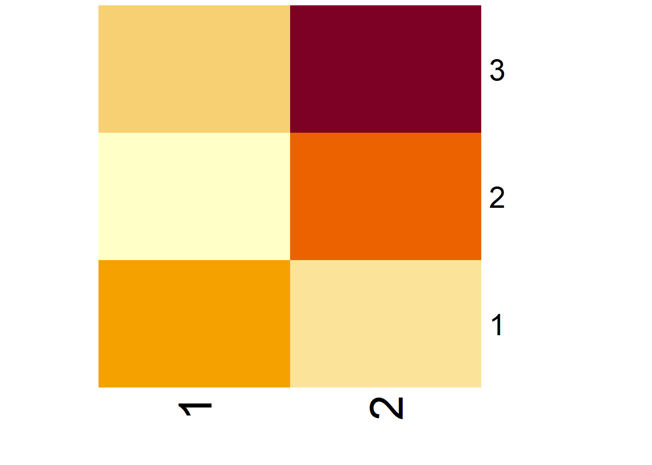
Heatmaps are just one way to represent a matrix. We can also create a 3D model from a matrix. Below, you’ll find three representations of the same data:

Matrix

Heatmap

3D model
Figure 4: Different representations of the same data
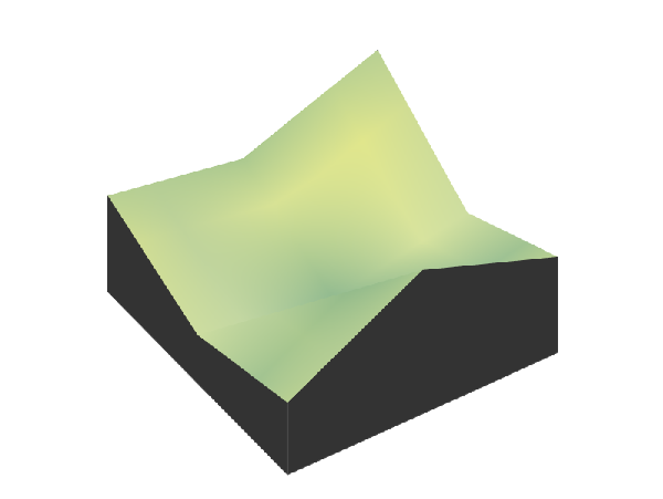
  1. Compare and contrast these three representations. What are the strengths and weaknesses of each?

  2. Now, focus on the 3D visualization. How would you create such a 3D model starting with a matrix? Identify the steps or processes involved.

Summary

Heatmaps and 3D visualizations are practical and engaging ways to represent data from matrices. A matrix, which is a structured grid of numbers organized in rows and columns, allows us to summarize and analyze data effectively. For instance, a heatmap can be used to visually represent the values in a matrix with color gradients, making patterns, overlaps, or trends easy to spot.

Imagine you’re analyzing social media usage overlaps, where each cell in the matrix represents the percentage of users shared between platforms. A heatmap of this matrix would use colors to highlight these overlaps, with stronger colors for higher percentages. Similarly, we can take this idea further by creating a 3D visualization, where the numbers in the matrix determine the height of each block in a 3D model.

Through this lesson, you saw how matrices can transform from abstract numbers into powerful visual tools. Heatmaps offer an intuitive way to see relationships at a glance, while 3D visualizations provide a tangible, spatial perspective on the same data. Together, these representations help uncover insights and bring data to life.

Glossary Entries
  • matrix() function

    The matrix() function in R is used to create a matrix. You provide a set of data, define the number of rows (nrow), and specify whether the data should be filled by rows or columns using the byrow argument. The syntax is matrix(data, nrow, byrow).

  • heatmap() function

    The heatmap() function in R is used to create a heatmap from a matrix or data frame. It visually represents the values in the matrix using colors, helping to highlight patterns and trends. The function has arguments like x (the data matrix), Rowv, Colv (for hierarchical clustering), and scale (to adjust the scaling of the data).

  • rep() function

    The rep() function in R is used to repeat elements of a vector a specified number of times. It’s helpful for creating matrices where the data follows a repetitive pattern.

  • 3D model

    A 3D model is a three-dimensional representation of data, where data points are placed in a three-dimensional space based on their values. This model can provide more depth and perspective compared to a matrix or 2D heatmap, making it useful for visualizing complex data relationships.

  • colorRampPalette()

    The colorRampPalette() function in R is used to create a sequence of colors that can be applied to a heatmap. It takes a range of colors and interpolates between them to generate a smooth gradient.

Modeling the World: Topography with Matrices

Let’s bring matrices to life with 3D printing!

Exploring Elevation Data Online

The Shuttle Radar Topography Mission (SRTM) was a NASA mission that mapped the Earth’s surface to produce high-resolution elevation data. This data is invaluable for understanding topography and has wide-ranging applications, from environmental modeling and urban planning to disaster risk assessment. By representing elevation data in a matrix form, we can use mathematical tools to analyze and visualize terrains, making it easier to study and solve real-world problems.

  1. What type of information does the SRTM elevation data provide? How could it be used in real-world applications?

  2. Explore the Derek Watkins’ Tile Downloader website. How is the elevation data presented? What do “30-meter resolution” and “tile” mean?

  3. How might the data from a single tile be represented as a matrix? What does each value in the matrix represent in terms of elevation?

  4. If you wanted to use this data to create a physical 3D model, what steps would you take, starting from the downloaded data?

Elevating Data into 3D Models
  1. How can elevation values in a matrix represent the physical features of a landscape?

  2. If we visualize this matrix as a grid, how would the differences between adjacent elevation values appear in a 3D model?

  3. What steps are needed to turn a matrix of elevation data into a 3D model? Can you describe these steps in terms of inputs, processes, and outputs?

One way to create a 3D model from elevation data is by using R programming with packages such as {rayshader}, {terra}, and {raster}. Below are the codes that will help you generate the 3D model of Mount Merapi.

# Step 1
library(rayshader)
library(terra)
library(raster)

# Step 2
S08E110 <- terra::rast("S08E110.hgt")
merapi_boundaries <- raster::extent(
  110.3967, 110.4967,
  -7.590278, -7.490278
)
merapi_matrix <- terra::crop(
  x = S08E110,
  y = merapi_boundaries
) |> 
  rayshader::raster_to_matrix()

# Step 3
merapi_hillshade <- sphere_shade(
  heightmap = merapi_matrix
)
plot_3d(
  hillshade = merapi_hillshade,
  heightmap = merapi_matrix,
  zscale = 30
)

# Step 4
save_3dprint(
  filename = "merapi_3d.stl",
  maxwidth = 150,
  unit = "mm"
)
  1. Can you explain what each step of the code does?

  2. What do you think the result of the code will look like? You can download the resulting STL file here. To view it, you can use an STL viewer, such as viewstl.com.

3D Printing the Model

Let’s print the 3D model! Use the STL file from the previous activity to print the model using a 3D printer.

Summary

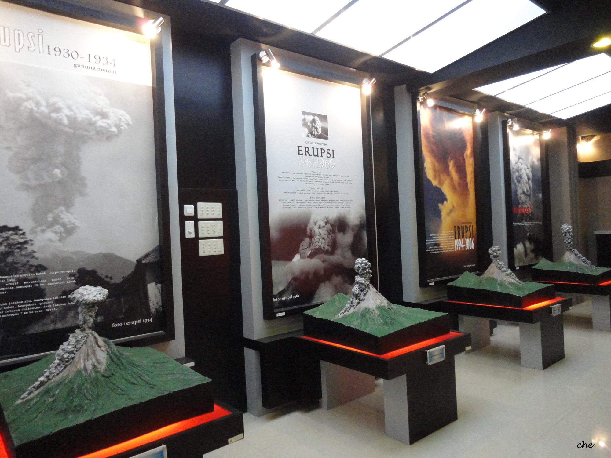
Matrices are a powerful tool for representing and analyzing data in a structured way. By converting elevation data into a matrix, we can visualize topographic features like mountains and valleys. In this lesson, we used matrices to represent elevation data from the Shuttle Radar Topography Mission (SRTM), and then transformed that data into a 3D model, simulating the physical features of the Earth’s surface. For example, we modeled and 3D-printed a representation of Mount Merapi, a well-known active volcano in Indonesia. The outcome of this process is shown in Figure 5.

3D model of Mount Merapi

3D printed model of Mount Merapi
Figure 5: 3D model and 3D printed model of Mount Merapi, created from elevation data, showcasing the transformation from digital representation to physical model.

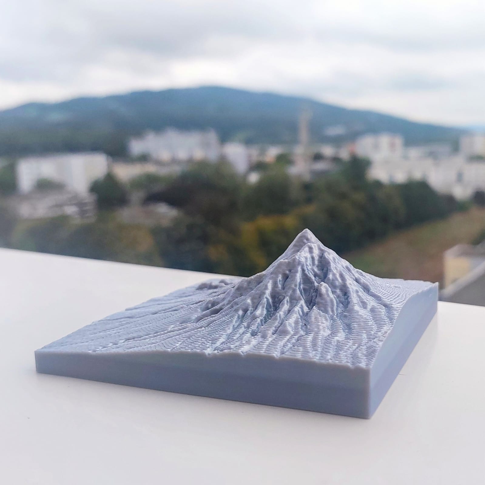
This exercise helps us see how abstract data can be turned into meaningful, real-world representations, such as terrain models, and how mathematics can be applied to understand and visualize landscapes. Through this lesson, you learned how matrices can be used to model topography and how 3D printing brings these models

Glossary Entries
  • STL file

    A file format commonly used for 3D printing, which stores 3D models in a way that is compatible with most 3D printers. The file contains the surface geometry of the model without any color or texture information. STL stands for “stereolithography,” a technology used in 3D printing.

  • Elevation data

    Information that describes the height of a location on the Earth’s surface relative to sea level. This data is often represented in a matrix format, where each value corresponds to the elevation at a specific point on the terrain.

  • Hillshade

    A grayscale representation of a 3D surface, created by simulating how light and shadows fall on terrain based on elevation data. Hillshading is often used in mapping and 3D visualization to enhance the perception of depth and topography.

  • Shuttle Radar Topography Mission (SRTM)

    A NASA mission that used radar to measure the Earth’s surface and create detailed elevation maps. The SRTM data is widely used for various applications, including environmental modeling, urban planning, and disaster risk assessment.

  • 3D printing

    A manufacturing process that creates three-dimensional objects by adding material layer by layer based on a digital model. 3D printing allows for the production of complex shapes that might be difficult or impossible to create using traditional methods.

  • Raster data

    A type of spatial data represented in grid cells or pixels. Each cell holds a value that represents information such as elevation, temperature, or land cover. Raster data is often used to represent continuous phenomena like elevation or weather patterns.

  • rayshader

    An R package used to convert raster or matrix data into 3D models and visualizations. It allows users to create shaded relief maps, terrain models, and 3D plots based on elevation or other spatial data.

  • terra

    An R package used for spatial data analysis, specifically designed to handle large raster datasets. It provides tools for reading, manipulating, and processing geospatial data, including elevation data.

  • raster

    An R package for working with raster data, including functions for reading, manipulating, and analyzing geospatial raster data. The package supports a variety of raster formats and is commonly used for tasks like terrain analysis.

  1. Emma wants to know the prices of iPhones on Amazon. She surveys the prices for the 128 GB, 256 GB, and 512 GB models of the iPhone 15 Plus, iPhone 16, iPhone 16 Plus, and iPhone 16 Pro. The prices she found are as follows (in euros):

    • For 128 GB: iPhone 15 Plus (€919), iPhone 16 (€876), iPhone 16 Plus (€1078), iPhone 16 Pro (€1143)

    • For 256 GB: iPhone 15 Plus (€1037), iPhone 16 (€1055), iPhone 16 Plus (€1188), iPhone 16 Pro (€1294)

    • For 512 GB: iPhone 15 Plus (€1289), iPhone 16 (€1269), iPhone 16 Plus (€1354), iPhone 16 Pro (€1592)

    Represent this data as a matrix!

  2. In the interactive code block below, create a matrix named matrix_iphone_prices to store the iPhone prices for different models and storage sizes. Then, visualize the matrix as a heatmap to better understand the price differences.

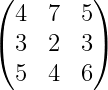
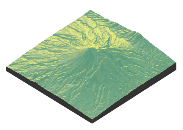
  3. Figure 6 shows a 3D visualization of a matrix. Write down the matrix with approximate values.
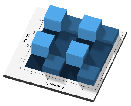
    Figure 6: 3D visualization of a matrix
  4. Model the topography of your selected places and then print the 3D models!

Reuse